Circuit Wolf
The Challenge:
Tasked with investigating the concept of corporate identity design, which includes logo development, product branding through the design and the creation of essential business collateral, and the development of an advertising campaign. The branch I was assigned was an IT Support Company whose name ended up being Circuit Wolf.
The Approach:
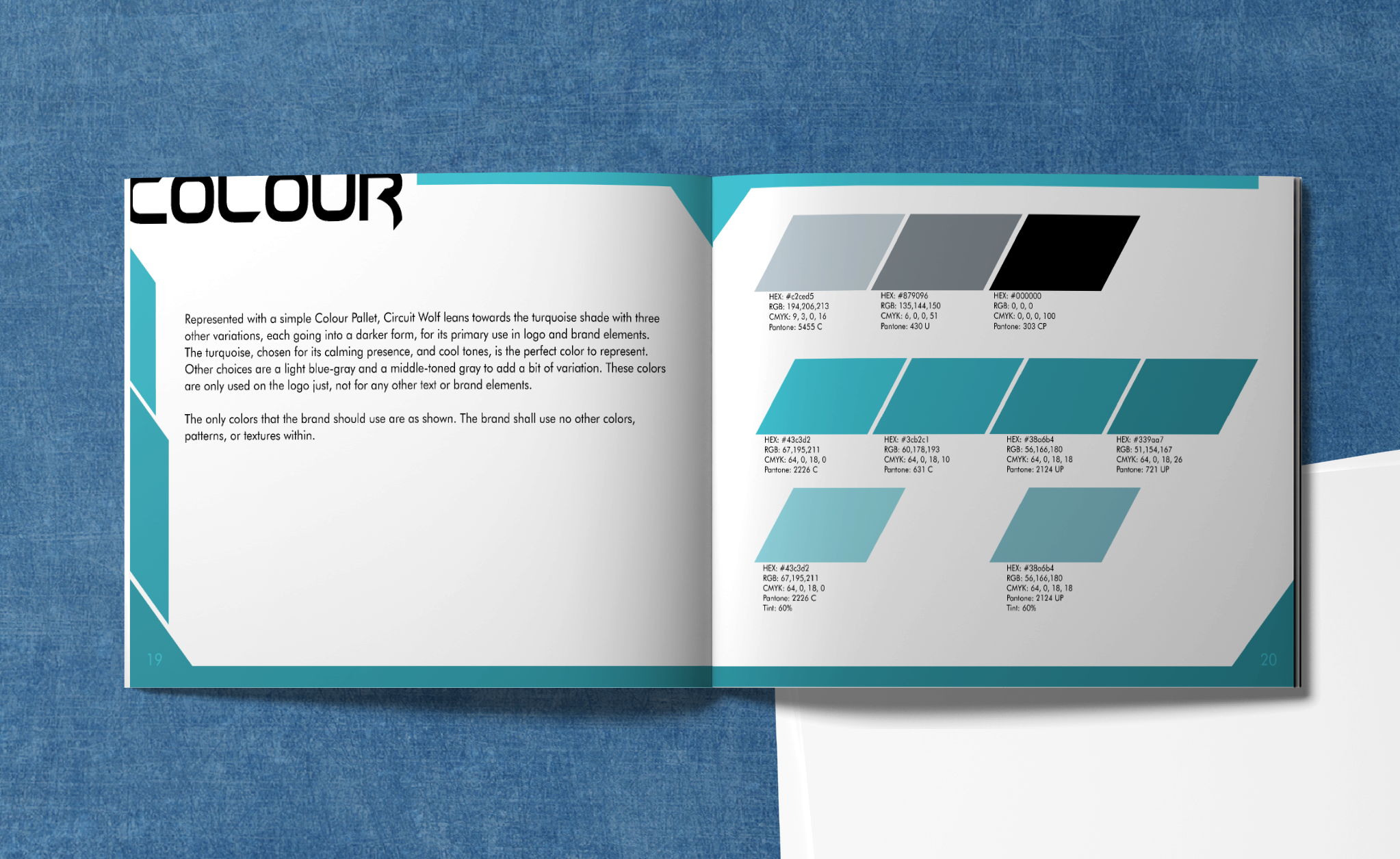
The first task was choosing what Logo would fit well with the name Circuit Wolf. I ended up doing a paw in geometric shapes as it looks very futuristic, then adding the font Hyper Helix to add to the futuristic look. I choose the use of an aqua blue color. The next task was creating a brand guideline booklet where all the rules list the dos and don'ts about using the Logo in different ways. The design incorporated the continuation of geometric shapes and four shades of aqua blue. Type family Futura and Hyper Helix both adding to the IT look. The last element was the creation of four different advertising ads. I chose to do a bus board, subway board, billboard, and a social media ad. Each is showcasing the same feature the brand is selling but with different looks. I am incorporating the design elements and representation of what one is offering in the IT Company.
What I Did:
The creation of the Logo was in Illustrator using vectors to complete the shapes. The brand booklet in Indesign where designed the layout and filled in all the texts, and the creation of the stationary items and Photoshop for the brand elements. Lastly the marketing ads in Illustrator where the designing happened, and Photoshop for placing into the mockup layout.
Part 1: The Logo
I first started the creation of the logo by creating thumbs that fit with the IT theme. With many renditions and getting feedback from peers, the paw on 55, 57, & 73 fits nicely together with the geometric shapes of 21 & 24. For the second round of thumbs, the paw was the primary shape chosen, that 1 & 2 were the ones that fit well with the brand. Taking the thumbs into Illustrator is where the final steps were taken using the pen tool. The logo achieved the last look.
Part 2: The Brand Guidelines
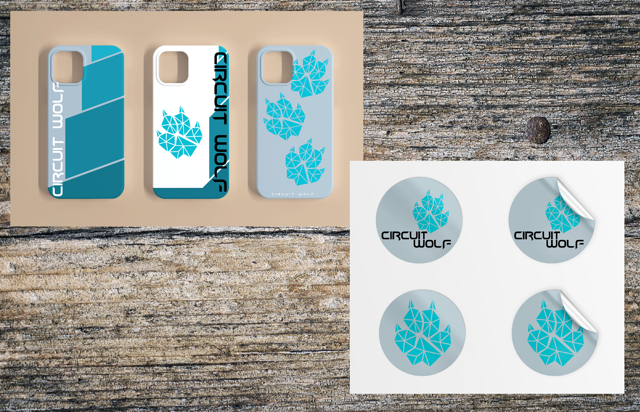
After creating the logo, came the creation of all the rules and guidelines associated with the brand. Explaining what the brand represents, what the logo, type, and color rules are, and the brand elements that the company is using. The creation of employees t-shirts and masks, reusable tote bags, and phone cases that the public can buy. To what stationary the company is going to use.
Part 3: Marketing Ad Campaign
The task was to think of four different marketing ads that display a new feature of your company. Choosing to do a 24/7 service I created four different yet cohesive looking ads. Taking what one would fix like your phone, laptop, tower or even your cloud and presenting them in a hexagon shape to enhance the geometric shapes that are represented in the logo. Adding a simple slogan to the ad, added to the effects of giving the future customers simple service by just fixing their computer.


