Top Destinations
The Challenge:
Creating an Editorial Piece in the form of a Magazine with your chosen topic. Requirements were 10 chosen articles, and Imagery that were a combination of your own and sourced online.
The Approach:
First step was choosing the topic for my magazine which ended up being Travel. Then came the process of choosing what places to feature and sourcing the articles and imagery for it. Next, I chose a typeface that went well with the look and feel of the whole design. Settling on Gill Sans and Roman for the body content, and Gill Sans Italic with Skia for the cover page. For a little extra cohesive elements I added coloured blocks under images that connect with colours from the opposite page.
What I Did:
Primarily using InDesign, I created the layout, placed pictures and text. Limited use of Photoshop to so touch-ups on the imagery.
The Cover
There were a few cover variation where the first one wasn’t such a clear picture and a few different colours of text. The final cover and back look more in tune with the magazine, from showcasing one of the locations to the text placement and organization of the overall layout.

Initial Cover

Final Front and Back
Single Page Layout
The Single Page layout shows limited text usually stating the most important parts when visiting the country. In the first version there were too many pictures with text all over the layout. In the second version, I added a colour strip on the side as too add a bit of difference into the design and made sure it matches a colour on the other page. In the final version it was cleaned up and I moved the colour underneath the pictures and to the other side. To draw ones attention to the page there is an interesting quote from the article shown. It was also transformed from a three column layout to a two column layout for better readability.

First Version

Second Version

Final Version
Double Page Layout
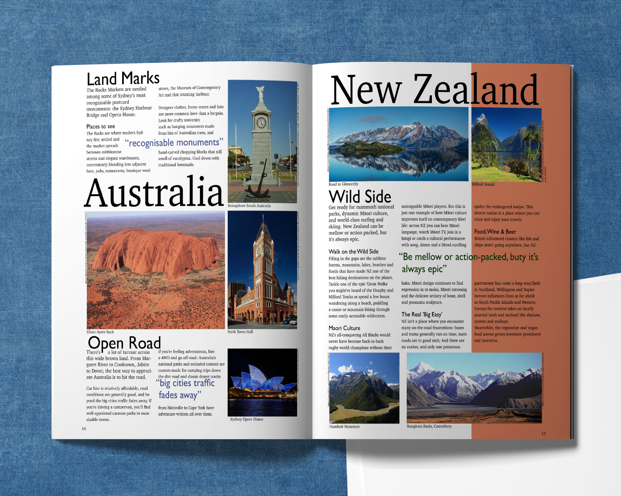
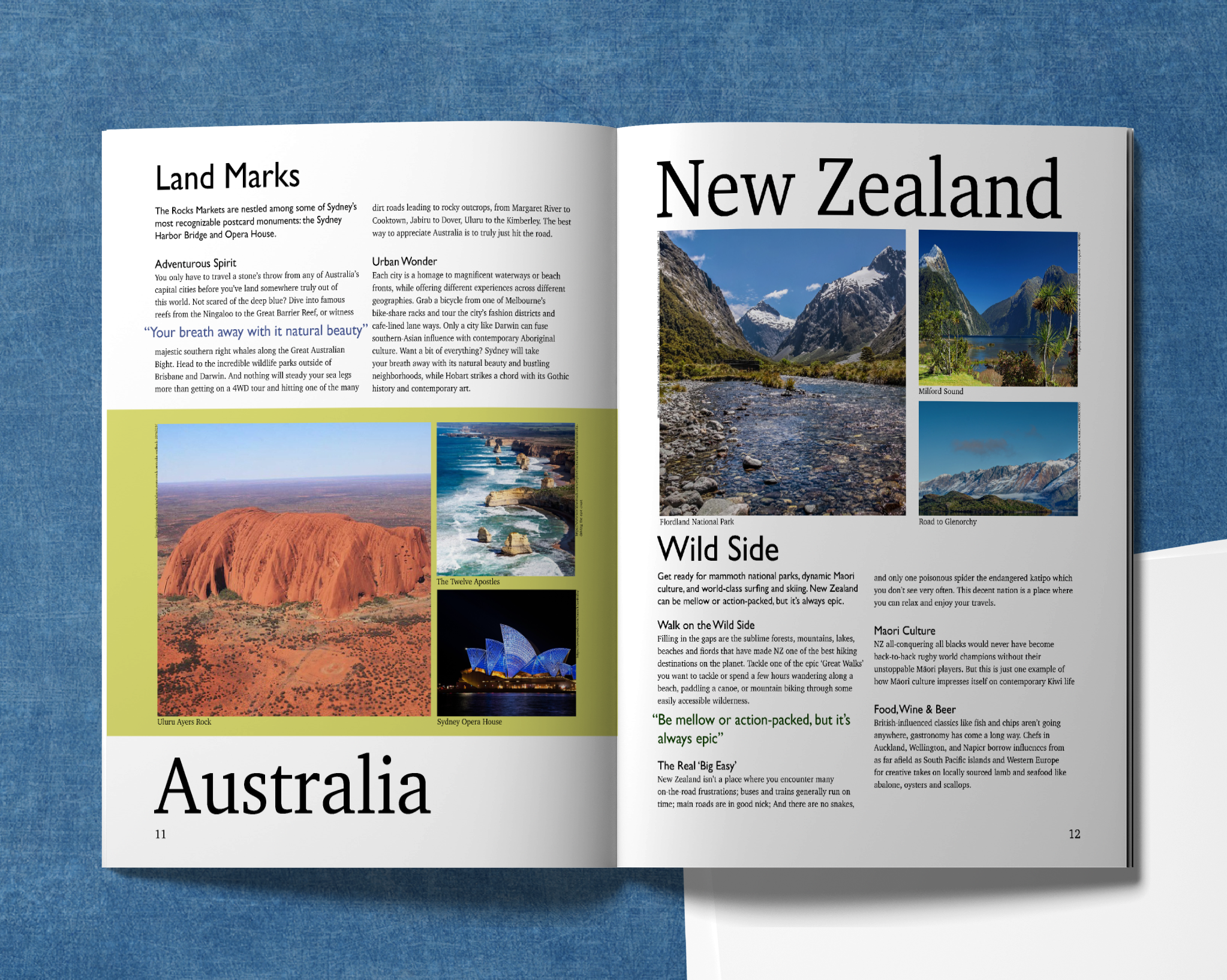
The double page layout was the first pages that were being tackled. It all started with coming up in a way to display the text and pictures so that they would create a cohesive look. Already knowing that the first test wasn't going to work, the second version was made with it slightly in mind. I placed the designation title on top of the pictures with the article underneath them. The Final version got the same treatment as the single page layout. With a colour strip and a two column layout, and some edited text.

Layout Test

First Version

Final Version
